To design online services which improve the experience for users when they transact with DVLA, it is important to understand what our customers need from us.
Our User Experience (UX) team use several different testing methods to get this insight. Dan Williamson, User Research Lead, explains more about user testing at DVLA.
Why, when and where we test
Government services should be as simple, inclusive and accessible as possible so that everyone can use them. If we want our customers to complete a transaction using a certain channel, we need to make sure what we offer them is the best it can be.
Testing happens throughout a service development. We determine the frequency and the method of testing based on the features within the service that have changed.
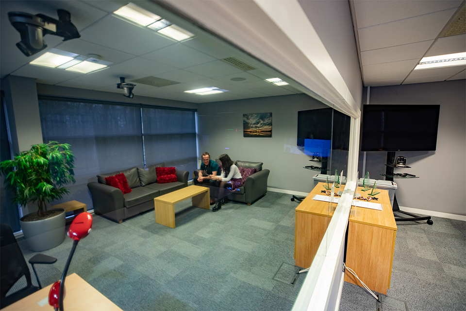
Under normal circumstances, we do roughly 40% of our testing in our UX Lab. It’s a state of the art facility that uses connected devices, cameras and microphones so that we can test developing digital services with users. With participant consent to filming, we record what we find and this footage is used to inform changes to the services and provides evidence for why we make those changes.

The rest of our research is carried out across the country in meeting rooms, in context in a participant’s home or place of work, or on the street.
Our testers
Some of our services are targeted at certain types of user (for example vocational drivers or drivers with a medical condition) and sometimes we will need to speak to specific segments within our customer base (such as people who have received a fine, use certain technology or are of a certain age).
We have a contract in place with a participant recruitment company and we send these specifications to our recruiters together with details of when and where we want to carry out the research.
Before testing starts
Once we have agreed the objectives for the research with the service designer, we plan the session with the interaction designers who build the screens we test.
We may ask questions like:
- which features do we want to test/discuss with the user?
- where do we think we may identify pain points?
- which research technique do we think will work best?
Then we write a topic guide for the session. This contains the main points and themes we want to cover during the session, as well as prompts for the researchers to remind them where to delve a bit deeper.
The day of testing
We always spend some time getting an understanding of the participants; how confident they are in using digital services, what devices or apps they use and a bit about their socio-economic background. This helps us to get to know them and puts the participant at ease too.
If we are testing screens for usability, we set the scene and give the participant tasks to complete. It is human nature to help people when they get stuck, but as researchers, the value comes from seeing where they fail.
Sometimes we conduct an in-depth interview with the participant. This is designed to understand their behaviour at a deeper level – why they do things in a certain way, how they feel about what we are talking about or what we could do to make things simpler for them.

Outcomes of testing
Every insight we get adds value – whether that is changing the flow of a service, moving things around on a screen or amending content. Every service we have been involved in has been changed based on our research.
It isn’t often that we get a real ‘Eureka!’ moment and a lot of the insights we get are used to inform subtle, iterative changes to a service that make it more useable, simpler and more inclusive. Equally these small changes could have a benefit to the organisation, such as increasing the ability for customers to self-serve or reducing casework and demand on the Contact Centre.
But sometimes user testing shows that a very small change can be beneficial. While testing the prototype for the penalty payment online with participants it was identified they did not understand that they needed to tax their vehicle or tell us they were keeping it off road, once they had paid the fine.
On the ‘payment successful’ page of the service, the participants were told in large bold print that they had to either tax, register their vehicle as off the road or dispose of their vehicle, however when asked what they thought they had to do next, the majority of users missed that instruction and thought they taken all necessary action to complete their task.
This was fed back and a new prototype was created so that the participant was taken to pages where they could tax, make a Statutory Off Road Notification (SORN) or dispose of their vehicle.

We are committed to user-centred design. We have a great record for user research at every Government Digital Service (GDS) Service Assessment which take place at several stages before we can put our service on GOV.UK.
Our research has been the basis for so many changes, from small tweaks to wholescale change in a constant effort to get these things right for our users.
Now you’ve seen all the hard work that goes into making a great online service – why not check out the wide range of services we provide on GOV.UK and try them for yourself?
1 comment
Comment by Dan posted on
Great blog Dan, you should be massively proud of what you've achieved with the UX@DVLA lab!